Friday, 16 December 2011

Question 7: Looking back at your preliminary task (the school/college magazine task/short continuity film sequence), what do you feel you have learnt in the progression from that to your full product?


Firstly I think that I have developed hugely from my initial preliminary task to my final media product. The first thing I’ve noticed is the amount of white space/lack of content on the first product, although I would put this down to my lack of knowledge and confidence within producing a ‘college magazine’, because I personally knew more about the music magazine and the concept was something that was familiar to me this meant I could produce it to a much higher standard. Also the design and layout in my first magazine are of a poor standard as they are almost too ‘neat’ and the sell lines or any features of the page don’t particularly jump out at the reader, this whereas in the second magazine although there is a lack of sell lines there is plenty happening on the page to keep the reader interested and curious. Also the main image on the first magazine isn’t entirely relevant and doesn’t really make a statement or show a purpose, whereas the second magazine is based almost entirely around this main image and this is what everything else on the page revolves around. Also there is only one image included in the first magazine which means minimal media resulting in bad presentation, so in my finished product I used a number of images to even out the balance between text and images.

A you can see the my contents page has developed massively from my efforts for the preliminary and my final product. The research definitely helped me in terms of content and layout of a contents page and exactly what needs to be included. A lot more colour has been injected into my music magazine and therefore it is presented a lot better than the college magazine, there are no pictures on the first task as again I struggled for what content to include, whereas in the second  one there is a big focus on balancing out the input of text and images so the page is more appealing and well presented.

Question 6: What have you learnt about technologies from the process of constructing this product?

Throughout the production of my magazine I have relied heavily on technology, not only as I used computing software to create my magazine but I used a number of cameras to get the images to include in the content.

Photography- Gathering photographs was relatively easy for me as I have taken the AS Photography course and at the same sort of time I was planning my magazine I took a set of high key photographs using a special type of lighting on a white background in order to create a bright tone. To do so I used an SLR camera in which I had to tweak the settings so that I could capture the best quality photo possible and therefore focused on aspects such as the focusing and the shutter speed. I used one of my photos from the high key set for the contents page as I thought it gave the appropriate ‘look’ and matched in with the semi- glamorous theme of the magazine. I also used a number of my friend’s digital cameras to captures images of my cover star and feature star which are just my close friends, I took images of ‘Lexy Laws’ every night we went out to events as she was then dressed up and therefore looked appropriate for the ‘Lexy Laws’ image, the majority of these images went towards the ‘spotted…’ section at the end of the double page spread.

Computing- These images, once taken, had to be uploaded onto the computer and transferred into a separate folder where there are organised before any edits are made.

Photoshop- When I began to use Photoshop at the beginning of the year I was really inexperienced in how to use the software and was unsure of how to function any of the tools but with me also doing my Photography course, I found it progressively easier to use as this subject is based around using this particular software. Just from experimenting and exploring the tool bar I found that my knowledge of what can be done on Photoshop has expanded greatly and I now feel a lot more confident in using it. I ‘placed’ all my images onto the appropriate magazine page and for most I edited them slightly, by using tools such as the dodge tool, the blur/sharpen tool, the spot healing tool and the healing tool; these were all to improve the quality and look of the image and to give them a ‘flawless’ effect that is in keeping with the people and look that’s involved and associated with my magazine.
I used the patch tool to fix images that may have had unwanted overlapping objects or people in the picture and this picture of my friend Michael I really wanted to use as I think he portrays the right image for my magazine but it had things overlapping him so I used the patch tool to correct this. I also used the blur tool to even out his skin and the pixilation to create a better quality picture.  
                   
Before                                        After


Question 5: How did you attract/address your audience?

Question 4: Who would be the audience for your media product?


Georgina
Georgina is a perfect example of my target audience, she’s 17 years old and enjoys socialising and having a good time, she's really into music and enjoys a huge range of genres. She's someone that will have the typical lifestyle of a normal 17 year old this includes a passion for shopping but life as an unemployed student means that she can't always afford everything she wants but presents herself in a way that people may lead people to assume she is 'well off' and handles any money she gets carefully. She attends college full time and her life is half revolved around doing the best she can in her A Levels; she would buy a magazine probably every other week but this may become every week depending on how much money she has at the time and if she wants to treat herself.

For her nights out she would attend events such as this ...


Because of Georgina's love for music she spends her spare time taking a further interest in the world of new music which helps her find new favourites and predict who will be the next big thing. She is the type to buy albums rather than illegally download as she respects the industry etc. These are some of the artists that she has an interest in...

Rihanna- Talk That Talk


Pixie Lott- What Do You Take Me For

Drake- Look What You've Done

She enjoys programs such as Teen Wolf and Misfits and America's Next Top Model

Question 3: What kind of media institution might distribute your media produt and why?

I think my magazine would be best distributed in as many selling points as possible, this would include supermarkets, newsagents, convenience stores, kiosks etc. I want to make it as easily accessed as possible and with a reasonable price of £1.50 I think it will definitely appeal to my target audience. I think that a good selling strategy would be to put it alongside the fashion and celebrity magazines which are extremely popular and because they have a similar target audience, the same people that would be going to purchase a fashion magazine would be able to see my magazine, compare it to the others and possibly chose to buy it. For a lot of people that would buy magazines I think they have the wrong concept of what they’re about and feel that you have to be a dedicated music lover that’s willing to pay a relatively expensive price in order to purchase one, but I want to expand the market for music magazines by incorporating aspects such as fashion and celebrity lifestyles creating almost a hybrid genre mainly about music in order to appeal to the biggest market share. I would advertise on both the TV and over the internet, specialising in places such as the ticketmaster website and may create our own website to add value to the product and allow the customer to feel they can access extra, exclusive information.

Thursday, 15 December 2011

Question 2: How does your media product represent particular social groups?


The photo on the left has been taken from my magazine and the right is from an existing magazine, more! which is a fashion and celebrity gossip based magazine that although isn’t completely relevant my intention is to incorporate some of this genre into my pop music magazine therefore expanding the target audience, this means that the public figures seen in magazines such as more! can appear in my magazine also and still relate to the majority of the customers. Firstly the right image is of famous pop singer Pixie Lott, right now she’s all about appealing to the youth of today and can pride herself on keeping up with the latest fashions as well as setting them. She’s young blonde and beautiful and with her known musical ability, fashion sense and bubbly personality she is considered an inspiration and role model, she is someone that oozes a fun and ‘normal’ attitude meaning that people can relate to her and will find almost all aspects of her desirable but realistic and achievable. The image on the left is of my friend Alex who appears as Lexy Laws in my magazine, her image as an artist is very similar to Pixie’s as she is portrayed as young, talented and fashionable which is something my target audience will admire. I chose to use this photo as I think it is recognisable with the image of the typical ‘popstar’ in the industry like Pixie for example, in comparison Alex is wearing a similar little black dress that accentuates her tan giving a radiant glow and they both have light blonde hair that has been styled to polish the look. Both girls look happy and relaxed which is something the reader will enjoy to look at and they have a similar stance of the hand on the hip to show off what they’re wearing and  show they are especially posing for the photo.

Question 1: In what ways does your media product use, develop or challenge forms and conventions of real media products?

Obviously when designing and throughout the creation of my magazine the intention was to make it look as authentic as possible and to incorporate every necessary convention so that it was up to the standard of existing products. I found a number of traits that applied to a big percentage of magazines including features such as a large dominant masthead and a main image. My aim was that when the magazine was finished it would feature all the familiar conventions but alongside an unusual colour scheme and a number of innovative layout ideas which would therefore make it different to all other existing magazines.

MASTHEAD+COLOURSCHEME
This is the magazine that has been the main inspiration for my own. The first thing that caught my eye was the colours and the masthead which really influenced my use of colour and design. Seeing that NME (which is a hugely popular music magazine) could use this sort of unusual colour scheme and it was a success meant I know there is a desire within the market for this sort of interesting layout and colour scheme which is why I wanted to imitate this look. My title also uses a gradient overlay so that it fades from purple to pink whilst moving across the word, it really stands out and although is seemingly quite girly it says elsewhere on the front cover that this is the ‘Femme Fatale Edition’ and therefore is more acceptable. I would have my front cover colour scheme quite different every week so that although the layout and name with become distinctive people will like to see a fresh batch of colours brought onto the scene so that it completely mixes it up and keeps it interesting.


IMAGES
I wouldn’t say the images are particularly typical of a music magazine as they’re all quite glamorous ‘photo shoot’ photos rather than using a number of photos from gigs etc. which you would often find in a music magazine as obviously the touring and gigging is a huge part of the music industry. I did this sheerly because of the fact it wasn’t really possible for me to photograph an authentic looking gig and the content I had planned didn’t really require these sort of photographs anyway. I do think that, if included, they would have been an asset to the content of my magazine but they aren’t essential.

COSTUMES

The costumes are, again, quite glamorous portraying an image that would be associated with popstars and celebrities in general which is where a fashion influence comes into the magazine as an extra aspect and a way to attract a new market to the magazine rather than just hard core music fans. They differ from the usual attire seen in the music magazines but most of these magazines are based on rock/indie or alternative music so they will obviously dress slightly differently to artists making contemporary pop music.
FONTS

When looking through a number of magazines from varied genres, I noticed that they use a number of different fonts that all work well together and can use them on one page without it looking too messy or inconsistent so I adapted this idea and used numerous of different styles to make the presentation more interesting and keep the authenticity of a real magazine.


MUSIC GENREPop is the main music genre of my magazine and I think that once reading the content and seeing the entire image that is put across this becomes quite obvious. This is because of the look of the featuring artists and the more mainstream content that will appeal to a wide category of people. I have chosen this genre of music as it was something I’m more familiar with and can therefore present it in the best way possible, also there are no existing pop magazines (to my knowledge) that have a sophisticated edge and can appeal to the teenage/young adult generation.

EVALUATION

CONTENTS PAGE

FEEDBACK FOR CONTENTS PAGE

CONTENTS PAGE FLATPLAN

Colour Usage- The colours here will be emphasising on different tones of purple that stand out on a neutral background, I’m keeping a lot of black and white in contrast to my bright purples so that the colour scheme doesn’t become too overdone and if any more dominating bright colours were introduced this would start to clash and look unprofessional. I think this colour scheme is appropriate for it being the ‘femme fatale edition’ and therefore will appear to the correct audience.

Text Usage-The text featured on this page will be relatively brief with only small sentences appearing as the whole point of the contents page is a summary of the following content so not too much should be given away. It features mostly sell lines as the reader may look briefly at it as a way to decide if they want to purchase the product, and this may persuade them that this is something they’ll be interested in, also because as I said it’s just something that will more than likely just be glanced at, it is important that the text and sentences are kept brief and interesting.


Layout and Font- My aim for the layout is for it to seem filled out with plenty of content but without looking crammed and over worked as this can be off putting for the reader. I therefore have planned to divide the page roughly into two so that two columns can be distinguished therefore making it appear more organised and easier to read. I plan to use a number of fonts but consistently for example all of the content page titles will be in one font, and all of the sell lines below will be in a different font..but the same for each. The CONTENTS title will be in the same font as the masthead on the front cover therefore keeping all the important text consistent with one another and this allows the reader to recognise this and therefore identify the most important part of the page.

Wednesday, 14 December 2011

INSPIRATIONAL CONTENTS PAGES

This is the contents page of LOOK magazine, I find it inspirational in terms of knowing what sort of things need to be included into a contents page and how to fill it out. I noticed that there is an 'Editor's note' which is something that I will definitely incorporate into my own contents page in order to build up authenticity in the look of my magazine. I like how there are two main dominant heading in the form of 'Fashion & Beauty' and 'Celebrity' therefore indicating straight away to the reader that this is a summary of the content.


This is the contents page of NME, once again it has the bold heading over the sections of content which just shows the reader that it is well organised and structured, also this is obviously all regular and relevant content as they all come under the given titles. The colour scheme is consistent and appropriate and matches the NME logo that is the trademark of the magazine. There is a miniature article included on the contents page that will give the reader a taster for how the articles are both written and presented before even going any further into the magazine, this is a good way of filling up the page but whilst still keeping a neat appearance.


This is the Vogue contents page, I like how they inject quite a lot of colour into the page and therefore keep it eye-catching and interesting for the reader, I also like how although there are there columns on the page there is no particular structure in terms of how the media is set out within these columns. 

DOUBLE PAGE SPREAD

FEEDBACK FOR DOUBLE PAGE SPREAD

DOUBLE PAGE SPREAD FIRST DRAFT

MAIN IMAGE FOR DPS

This is the main image I want to use for my double page spread article, I thought that both her attire and expression looked appropriate here. In order for this to be ready to use in my magazine I will make some alterations by editing it to correct any blemishes and I will remove the background so that it can be seamlessly placed onto the page and whatever background is in place.

IMAGES FOR DOUBLE PAGE SPREAD 'SPOTTED...' ARTICLE

The following images are what I'm going to use for a 'mini article' on the end of my double page spread interview. It's called 'SPOTTED...' and the intention is that it is a more regular feature that appears in the magazine every week using the relevant star that it more than likely to have been interviewed in the double page spread. It uses a range of pictures of that star where they have been spotted out and about at certain events and shows off not only their high profile lifestyle but their high profile wardrobe also! There is always a 'winning look' as well which is in another format to the other pictures and will have a small banner on it to make it clear that this is our favourite look. A few of the images will be captioned with exactly where she was at the time but this will be kept to a minimum as I don't want it to look too cluttered. These photos have been chosen as they are all different but are all in a similar format of a full body shot minus a few which means they can be presented in a more professional way rather than a load of random photographs. They will all be edited minimally to ensure that they are of the best quality and that any blemishes are corrected. 


Monday, 31 October 2011

DRAFT FOR INTERVIEW

When you’re known around the world from the age of 12 no one was surprised when Lexy decided to take a well-deserved career break aged just 18 last year…but now she’s back, better than ever and with a brand new attitude!

So Lexy….you’re back! How does it feel to be working such a demanding schedule again?
I’m so so glad to be back and working again, I don’t regret my past year at all but it’s just comforting to be back out there again, I’m so grateful for the support I’ve received and I can’t wait to release all my new material for the fans!
I’m sure they can’t wait to hear it! So what was it that made you decide to take a year off?When you’re in the industry from such a young age you completely lose a huge part of your childhood and everything becomes about your work…even some things that may seem like fun were still work related and of course I’m really grateful for all the opportunities I’ve been given but I just wanted to have a year of my life to myself, before I’m officially an adult, just to be an 18 year old! Also when you’re a young woman in the industry there is a lot of pressure on being how everyone wants you to be and this really affected my self-esteem, so by taking this break it was just to relax the spotlight on myself and really find myself before re-presenting it to the world.
Well we LOVE your new image here at BOOMBOX, what would you say is the biggest change you’ve made to yourself over the past year?It may seem like the easy answer but in all honesty I’ve matured a lot, stripping myself from such a demanding schedule and lifestyle for such a long time means that I had a lot of time to myself to think about what I want to be and how I want my music to reflect this. I wanted to come back as a woman now rather than a girl and I hope that this is shown through my new image and music.
You certainly look the part! your new album ‘Dream Catchers’ is out November 8th, will we see a big change in the sound compared to your previous albums?Definitely! It’s got more of a soul sound, there’s some dance tunes on there along with some really emotional ballads, I would say this time round there’s been so much more concentration on the lyrics which makes each song so much more beautiful. BUY THE ALBUM PLEASE! Hahaha.
Well I’ll definitely be sure to purchase my copy, sounds fab! So what’s next for Lexy?I’ve just got loads of promotion for my new album over the next couple months, I’m going to be jetting off all over the world and doing loads of gigs so it’s all go! I’ll be lucky to get a good night’s sleep looking at my schedule hahaha but it’s all worth it in the end!
Aww I’m sure it will be, well thanks for chatting to us Lexy! BOOOMBOX wish you all the best and hope to speak again in the near future.Lexy’s album Dream Catcher’s available for purchase November 8th in the UK.

Sunday, 30 October 2011

DOUBLE PAGE SPREAD FLAT PLAN AND RATIONALE.


Colour Usage- For this article I intend to use a whole new scheme of colours but by keeping the consistent banner across the top of the page the magazine’s original theme of colours can be kept and identified. I want to use a mixture of beiges and fuchsia pinks/coral as I think these colours together will really compliment one another and will effectively make the text ‘pop’ out on the page. The main body of text will just be in black or possibly white depending on the background colour as these two are the easiest to read and this is appreciated by the reader.
Image Usage-The main image will be of the artist herself and will take up roughly a third of the whole thing, it will be a photo where she is posing especially for this article rather than using a candid which would probably be better for a smaller image somewhere else within the article. I intend to use a number of small images for my small mini/side article right at the bottom but I am still undecided on exactly what this will be.
Text Usage-The text will include a series of questions and answers but will be typed up in a more casual manner as if it was just a conversation between the artist and the interviewer. It will be in bulk but because of the surrounding images and headlines etc. this won’t seem too much to the reader. There will be a headline that’s broken into 3 separate parts and three different fonts will be used, this is all to make the page seem more appealing an
Layout and Font- As displayed I’ve tried to fit everything I need onto the page without making it look too crammed and I thin the end result will look professional and well laid. I want to ensure there’s an relatively equal balance between text and images so that the reader doesn’t feel there is too much of either media. When coming to the actual creation of the page there will obviously be a few retouches in terms of position and angles etc. so hopefully this will make it look more interesting  and visually creative. I want the main body of text to be in quite a plain and simple font so it doesn’t distract from the other features of the page and it must be easy to read if it is in bulk. The headline will be in a few different fonts that clash but go well together at the same time, ‘RETURN’ and ‘Lexy’ will be relatively large as they are the most important parts of the page whereas ‘of the nation’s favourite blonde’ isn’t as important so it will be slightly smaller to balance out the other text.

INSPIRATIONAL DOUBLE PAGE SPREADS.

I really like the layout of this double page spread, there is a lot going on but it doesn’t looked crammed or overdone which I think is important for the final visual effect. I’ve noticed that one thing in common with nearly all double page spreads is that the main subject of the article is always displayed through a huge picture that takes up nearly a whole side and therefore there is no mistaking who it is about. Although there are a few different fonts used they are all very similar and don’t clash at all therefore keeping it looking neat and professional and there have been a numerous techniques used to emphasise certain parts of the headline for example ‘BUT NOW I WANT MY JOB BACK’ is in a whole different colour, all in capital letters and with an exclamation mark as well, the ‘BACK!’ is underlined to show this is the most important word in the headline. The fact the headline is in quote marks makes the actual article seem more genuine and as though they have a reliable source that has given them true information. I think that it’s good how all of the pictures are relevant and although there are quite a few this doesn’t seem too much as they have been balanced out by the equal amount of text, I also like how the main body of text has been centred to the page as I’ve often found that all of the text gets crammed on to one side of the A3 therefore leaving less room for extra pictures etc.
Although this is from a fashion magazine it is specifically a music interview which I have found really helpful as it’s something I would usually read anyway and therefore appeals to me. I like how there is a huge main image which is almost introducing the artist to the reader for the first time so it’s important that this displays her image correctly and that the reader can see her clearly. I like how they have given her a big introduction, including how she arrived to the interview and what she was like whilst answering their questions as this builds up character and allows the reader to know more about her personality which is especially important when it’s an up and coming artist that the public aren’t too familiar with yet. I read the interview and I really like the way the questions are asked, obviously the interviewer would have had some guidelines and must ask questions but most of the stuff asked all link in with her previous answer which makes the interview seem much more like a conversation and therefore more interesting for the reader. I like how this is a very simple layout with plain fonts as it makes the main image a more important feature and the focus is more on the actual content rather than the visual representation which can have its drawbacks but in this case I think it works well.


Firstly I love the font used for ‘Beyonce’ in this as although it’s a completely different font to the second part of the headline the clash works really well, I think this font has been chosen purely because it looks most appropriate for her name, almost like the font reflects whatever the actual word is. Once again there is a huge main image of Beyonce herself to break up the page and balance out the text, this is along with the two other large images which are both relevant, I also like how the main image is a professional photo taken while she is posing on the red carpet whereas the other two images are more like candids showing the reaction of her husband and friend when she broke the news. By using photographs that are more personal and natural of celebrities the reader almost feels like they are getting a deeper insight into their lives and this is therefore appreciated. I’ve noticed how on almost all articles there is a small introduction in a larger font to the main body of text which is almost like a sell line itself, as although the reader is on the page itself they can sometimes just look at the pictures and then skip to the next page so by using big headlines and introductions it’s almost dragging the reader’s attention to the text. Also, all of the images have brief captions which I think will be a good idea to use in my double page spread to make it seem more authentic.

Wednesday, 26 October 2011

MOODBOARD

My moodboard demonstrates a collection of colours, fonts, images and magazine clipppings that inspire the look of my magazine, I have annotated everything that features on this page with why I particularly like it and what I can take from it to apply to my magazine.

FEEDBACK OF FRONT COVER FIRST DRAFT

I am really pleased with all the feedback I recieved as there were plenty of really positive remarks along with alot of constructive critism of how my magazine could be improved. I have read each comment individuallly and plan to take all of the advice on board and apply it to my front cover in order to create the best possible version of my front cover. Things suh as applying more sell lines and text to the background are definitely aspects that I will experiment with as these could change the whole layout and look of the magazine and therefore won't be a definite changeto be made.

Saturday, 22 October 2011

FILMSTRIP/PHOTOBOOTH

This is the filmstrip that inspired my own that features on the front cover of my magazine, I like that it's fun and shows an aspect of Pixie's personality which is something I want to show through Roxy. I have adapted this into what's most appropriate for my magazine so it looks like this...

Friday, 21 October 2011

EXPERIMENTING WITH TEXT AND EFFECTS


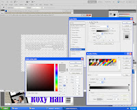
These screen shots are displaying how, I decided to add text under the masthead also so that the look was consistent and used to full effect, I also though this would be appropriate if it was faded in and out from both the bottom upwards and the top downwards.

Wednesday, 19 October 2011

MORE IMAGES


The above images are what I intend to use in a film strip sequence on the front cover to promote a sell line and make it more appealling to the public. I have chosen to do this style of photo as it makes the artist more relatable and down to earth and shows that don't take themselves too seriously which is always appreciated by the general public and can make them alot more interesting. I purposely used these exaggerated props in order to achieve this effect and make it work.

Friday, 14 October 2011

MAIN IMAGE

This is the image I would like to use as my 'main image' on the front cover, I intend to remove the background and may or may not convert it to black and white. This is because I would like it to both stand out from the rest of the coloured text but still fit in with the colour scheme as it may look unprofessional to use too many colours.

Monday, 10 October 2011

FRONT COVER FLAT PLAN AND RATIONALE


RATIONALE.

Colour Usage- my colour scheme will be a mixture of purple tones alongside navy blues, I will also be using a neutral grey/beige colour for the background of my front cover and these colours will all feature as a consistent theme throughout my magazine. I intend to use a few flashes of bright, bold colours on my front cover and throughout the contents to make the appearance more interesting and visually appealing, these won’t be part of the main theme colours though.

Image Usage- I intend to use a number of images as they are the main attraction of any magazine. The main feature images will be large and definitely made as the focus of my articles, I want to try and edit one set of images so that they appear to be in a film strip as if just collected from a photo booth.

Text Usage-A masthead will appear at the top of my front cover in a very bold font, that will stretch the width of the page. I want to use a colour effect on it that means it will fade from one colour to another, therefore standing out off the page. There will be a few sell lines to entice the public and these will be in alternative fonts, again in bright colours. As of yet I haven’t picked one font that will be used consistently throughout but I intend to make all the titles different fonts that are still yet appropriate and give a professional finish.

Layout- I am using another magazine to inspire my layout with the large cut out image centred and large with the text surrounding and overlapping to give a hectic yet neat presentation. I am following all of the stereotypical layout rules with the masthead at the top of the page along with the date etc. then a main image and a number of sell lines so this will be familiar and therefore appealing to the public.

Thursday, 6 October 2011

MARKET RESEARCH QUESTIONNAIRE

I used a questionnaire that was distributed to people around the college too find out about what by target audience would be and what they would prefer in terms of factors of my magazine.

The questions were the following...(I will include the most popular answer)

Age
16
Male/Female?
Female
How much would you pay on average for a music magazine?
£1.50
What's your favourite part of the magazine?( (interviews/competitions/pictures etc.)
Pictures
Anything you specifically dislike about magazines in general?
When there's too much writing/ advertisements
Which magazines do you buy regularly?
more! and LOOK
Why these magazines? Please can you be specific about what is contained in these magazines that you like?
Because they include brand new gossip that's exclusive and they always have plenty of pictures.
What would influence you to buy a different magazine?
If it had an eye-catching front cover/ a familiar/attractive celebrity on the front.
What types of stories would you take the time to read within the magazine?
Exclusive news and any interesting up and coming artists.
Do you prefer a weekly or monthly magazine?
12 said weekly, 3 said monthly.

Wednesday, 5 October 2011

IMAGES


I have chosen to use the above 6 images in my magazine as part of the main article, giving it a title of the artists 'Top 6 albums' as I think it will make the page look both interesting and colourful with all the images featuring.